Weekly wrap-up #1: Personal website overhaul!
The first issue of the Weekly Wrap-up is about personal websites.
Welcome to the first issue of my weekly wrap-up! I have created a weekly summary covering one topic. Throughout the week, I based it on my experiences. And the topic for this week is “Personal Website Overhaul!”
If you have any suggestions or feedback, please feel free to comment. Enjoy!
Short story
Last week, I started working on my new personal website, including my portfolio (case studies) and blogs. Although I have a Notion portfolio, my website hasn't been updated since 2022. I will share the context later as to why I made a notion portfolio as a quick solution.
As designers, our yearly goal is to update our personal or portfolio website at least once. After seeing this, @brian_lovin tweeted, asking for those who have redesigned their personal personal website recently.
Also, this one from @DannPetty
As designers, we always want to update our website or portfolio.
We understand that having a good portfolio is crucial for getting hired. It also showcases our skills. That's why we dedicate significant time each year to updating it. We also stay current with the latest trends. But what does "update" mean? Is it about changing colors or adding more projects? In today's world, updating your portfolio involves much more than that.
For instance, now that your portfolio is online, it is vital to keep it up-to-date. Like in real life, if you haven't looked in a mirror recently, people will perceive you as outdated. The same goes for your CV. Others will see it as outdated if you haven't updated it since graduation. In this newsletter, I want to highlight some of the best portfolios. I'll also share design tips. I'll discuss the insights I gained while designing portfolios and websites. Keep reading to discover more and enjoy!
😲 Design Inspiration
This newsletter is about portfolios. I want to share my top five favorite portfolios. I'll also include a bonus pick that never fails to impress. These portfolios have fantastic designs, especially interaction. As a UI Designer, one of my long-term goals is to create impressive and useful portfolios.
Marco Cornacchia
It's an interactive website, so make sure to check it out and click and hover over every element. It also includes audio. Check out DotOS and let its scrolling interactivity amaze you 🤯. Marco is currently working as a Product Designer at Figma.
Rafael Conde
A video loop of the hero banner caught my attention. It was entertaining, simple, and unique. Additionally, I use the Hand Mirror app for online meetings, which is useful. I also appreciate how it highlights people I would like to meet. It's enjoyable and beneficial. Rafa is currently working as a Product Designer at Sketch.
Rauno Freiberg
The website's animations and interactive elements are more detailed. The navigation mimics the MacOS experience. Be sure to visit the "Craft" page to experience each interaction firsthand. Rauno is currently working as a Design Engineer at Vercel.
By the way, I’m a huge fan of Vercel Design teams. I like Emil, the creator of Sonner and Vaul. And Shadcn, the creator of Shadcn UI.
Brian Lovin
From the bookmark page to the Ask Me Anything page, even the stack page is useful. It’s clean and simple, but I appreciate how Brian's website engages with readers or visitors. You can leave a comment, react if you are using that app, and much more. Brian is the CEO of Campsite and is one of the hosts of the Design Details podcast.
Claudio Guglieri
The website's hero section is captivating and engaging because of the video. It showcases Claudio's work as you scroll. Claudio is the Head of Design at Opal Camera.
Bonus: Pedro Duarte
I want to add this to my favorites. I have been a big fan of Pedro's work in design systems ever since I discovered Radix UI. I also love Pedro's new website. It is interactive. It will spark your curiosity about what will happen when you click on it. I would like you to take note of the blurry background in the video. Pedro is currently working as a Hype Lead at Raycast.
Bonus: SJ Zhang
I will also add this as one of my favorites. Like Brian Lovin's website, I appreciate how SJ creates a reading list and newsletters. He also shares his investments (yes, for real). I particularly like the use of shortcut keys to navigate to specific pages. The dashboard-like layout of the site appeals to me as a UI designer since I work more on SaaS/Dashboard design. SJ is currently working as a Founding Designer at Compound.
✨ Life Reflections
When I was searching for a new job or freelance, I attempted to add extra time to designing and coding the website. Yet, I now have a portfolio in Notion to share with select companies. This is because of non-disclosure agreements with clients and past employers. Designing a portfolio in Notion can be both challenging and fulfilling.
Updating a notion portfolio is not as simple as formatting or adding an icon or hyperlink. However, it is easy to update and hide projects that are not relevant to the company's industries. Here is a preview of my notion portfolio.
Why not use no-code solutions? Like Framer and Webflow
That time, I want to ship fast to present my case studies, and the notion can save time since that is a short-term goal. However, I still prefer coding my website since it can be scalable and easily updated. As a UI Designer, I still want to learn to code and make it easy to plug and play with other javascript libraries like D3, GSAP, Framer Motion, and more. But also, I’m still using Framer and Webflow, but mostly for freelance projects. But let’s see what could happen.
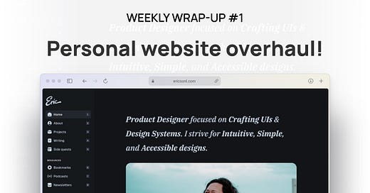
I am redesigning my portfolio with a format like Brian and SJ's website. I plan to include a curated UI Design and Design Systems reading list. I also plan to include my favorite podcasts from Filipino and international sources. I want my portfolio to showcase both international and Filipino works. Here is the work in progress.
But here is what I learned about redesigning your portfolio. You must show how you execute your design process when searching for new job opportunities. Present your work in a way that impresses recruiters. Additionally, an online presence can be helpful. Showcasing your skills through a personal website is beneficial. It's better than relying on 👌.
When redesigning a portfolio or website, there are a few key considerations to keep in mind:
Purpose: It is important to identify the purpose of the portfolio and how you intend to use it. Will you use it to seek a new career opportunity or showcase and update your portfolio or website?
Content: Consider the projects and accomplishments you want to include in your portfolio. Are you planning to write or start a blog?
Design: Do you want to follow the latest trend or consider the look and feel of the portfolio?
Maintenance: Will you be updating monthly or yearly?
💪🏼 Design Tips
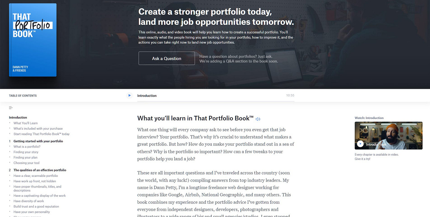
I don't have any design tips for this week related to portfolios or personal websites. But I recommend checking out a book by Dann Petty about creating a portfolio. You can visit the website for the book That Portfolio Book.
This step-by-step interactive video lets you read, watch, and listen. It is one of my favorite books on creating a portfolio. As it is a new year, I am giving away a "PDF Only" version to one lucky reader. Please make sure you are joining my newsletter to be eligible.
👀 My Recommendations
Our weekly wrap-up focuses more on portfolios. Here are some resources that might be helpful:
Design Life Podcast: Positioning your portfolio for a design manager role - The Design Life Podcast has a great episode. It's about positioning your portfolio for a design manager role. It discusses how to make your portfolio stand out.
Show Your Work by Austin Kleon - one of my favorite books on showcasing your work.
Bestfolios and Killer Portfolio are two great sources of inspiration for design portfolios.
The portfolio presentation that got me hired as a design manager by Femke.design - Femke shared a video about how she got hired using her portfolio presentation.
I hope this recommendation helps you build a new look for your portfolio. What are you currently planning for your redesigned website? Share your progress in the comments!
✌🏻 That’s all for this week!
Thank you for reading the first issue of my weekly wrap-up. If you like this format or have any suggestions, please message me on Twitter at @ericsonl_. Also, don’t forget to sign up for my newsletter for a weekly update (hopefully). I will send an email to the winner on February 4.


